Introduction to quantitative methods with
Chapter 3: Representing data with ggplot2
Introduction
Note
- Exercises associated with this chapter here

ggplot2
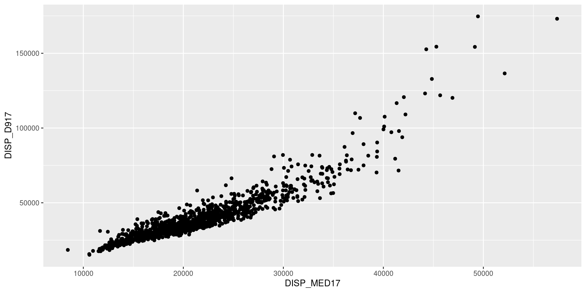
Initialize a figure associated with a dataset
ggplot2
Add layers (+) with geom_* functions
ggplot2
Parameterize layers with aes
Note
Aesthetic control of a geom_ layer is done through:
aes: variable parameters of the layer linked to a variable;- outside
aes: parameters that apply uniformly to the layer
ggplot2
Add layers (+) with geom_* functions
ggplot2
Modify scales with scale_ functions
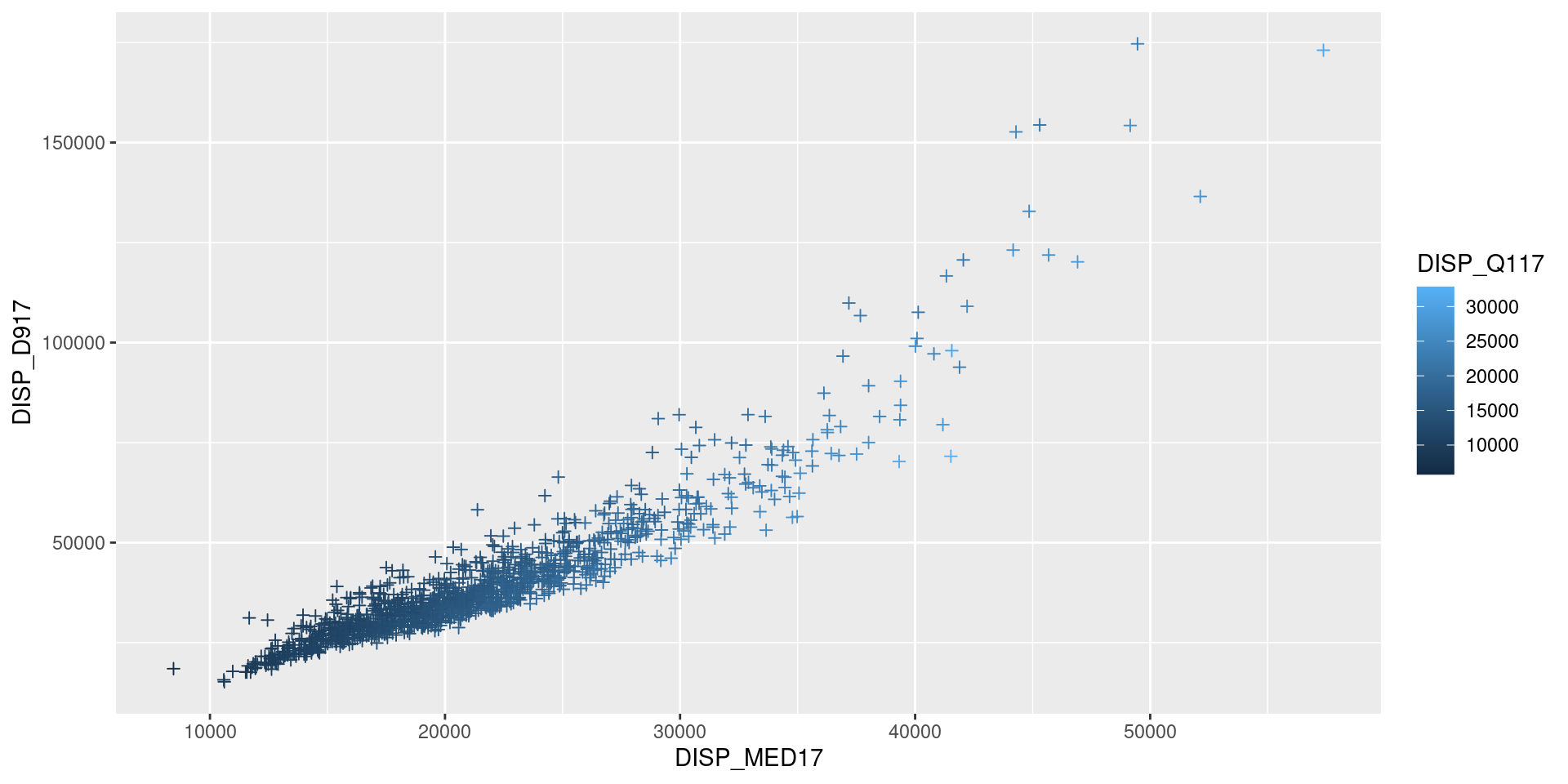
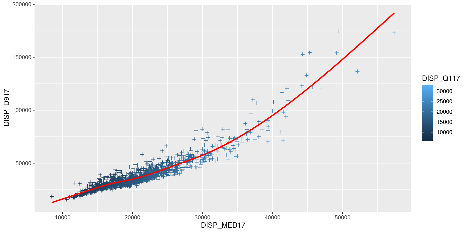
ggplot(df, aes(x = DISP_MED17, y = DISP_D917)) +
  geom_point(aes(color = DISP_Q117), shape = 3) +
geom_smooth(color = "red", alpha = 0.7, se = FALSE) +
scale_x_continuous(labels = unit_format(unit = "k", scale=1e-3)) +
scale_y_continuous(trans='log', labels = unit_format(unit = "k", scale=1e-3)) +
scale_color_viridis_c()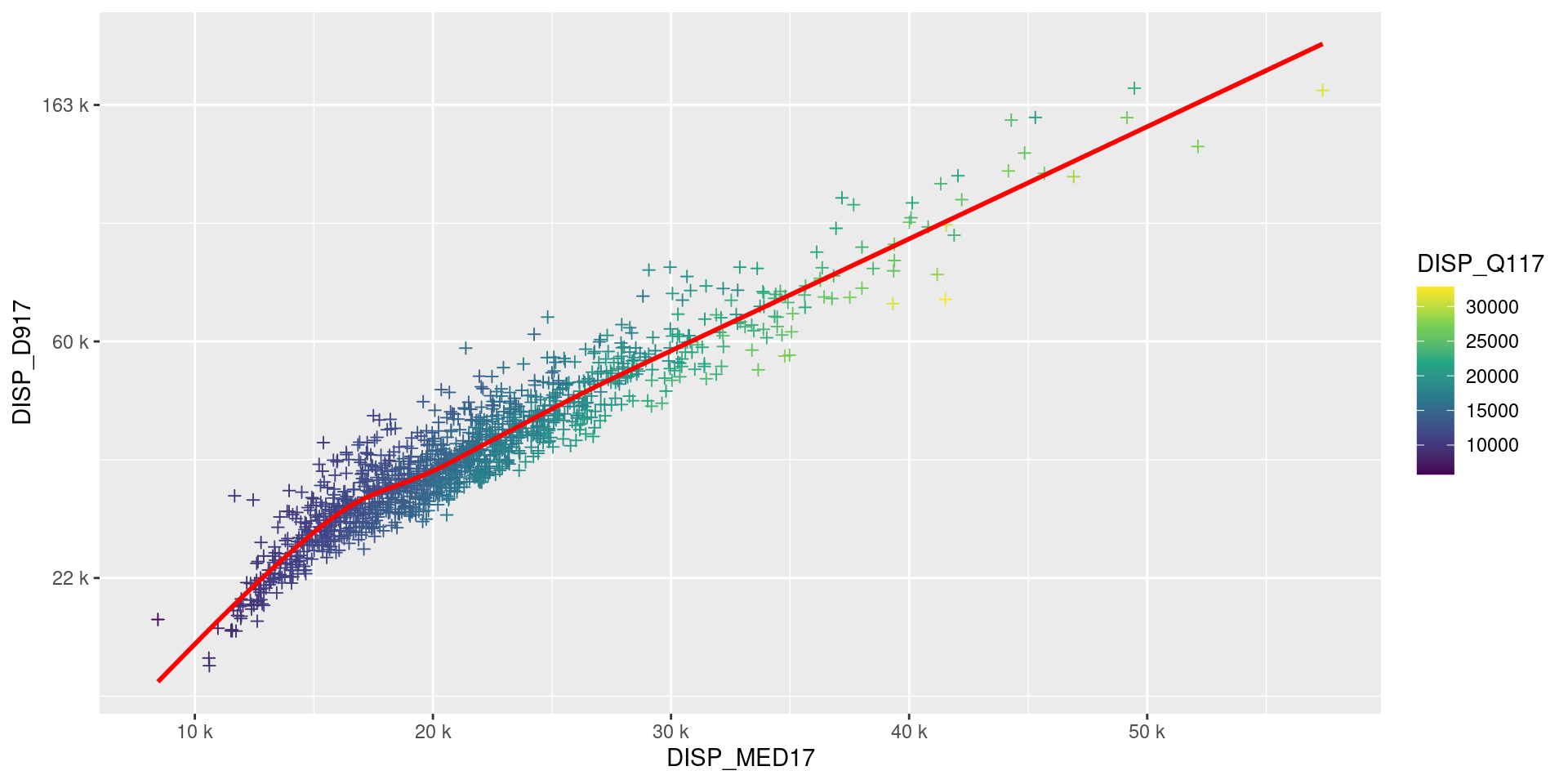
ggplot2
Modify scales with scale_ functions
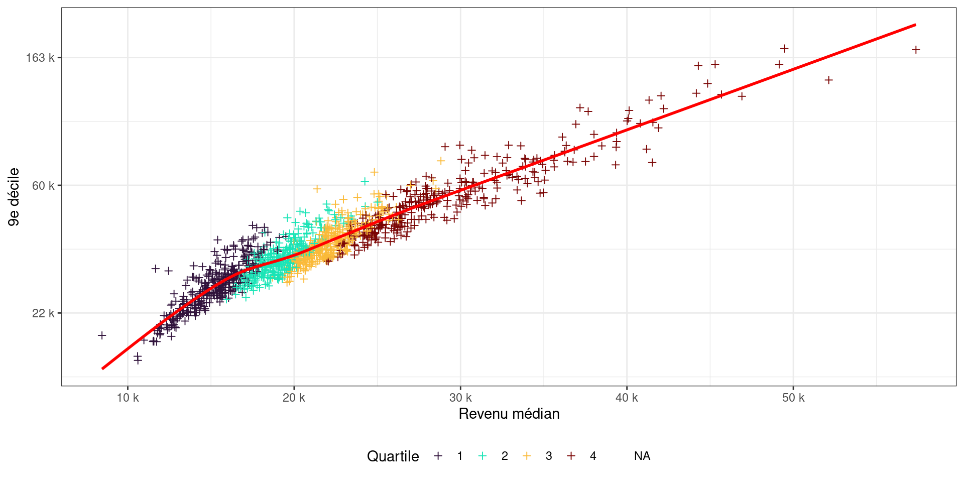
df <- df %>% mutate(quartile = factor(ntile(DISP_Q117, 4)))
ggplot(df, aes(x = DISP_MED17, y = DISP_D917)) +
  geom_point(aes(color = quartile), shape = 3) +
  geom_smooth(color = "red", alpha = 0.7, se = FALSE) +
  scale_x_continuous(labels = unit_format(unit = "k", scale=1e-3)) +
  scale_y_continuous(trans='log', labels = unit_format(unit = "k", scale=1e-3)) +
  scale_color_viridis_d(option = "turbo")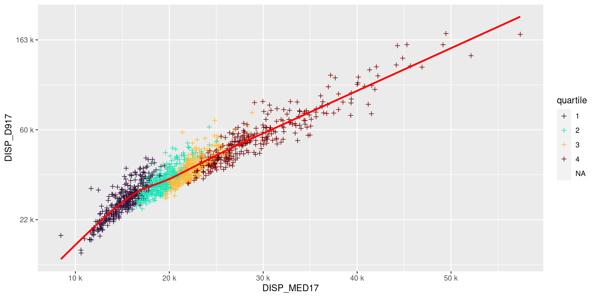
ggplot2
Modify aesthetics, only at the end
p <- ggplot(df, aes(x = DISP_MED17, y = DISP_D917)) +
  geom_point(aes(color = quartile), shape = 3) +
  geom_smooth(color = "red", alpha = 0.7, se = FALSE) +
  scale_x_continuous(labels = unit_format(unit = "k", scale=1e-3)) +
  scale_y_continuous(trans='log', labels = unit_format(unit = "k", scale=1e-3)) +
  scale_color_viridis_d(option = "turbo")

p + theme_bw() +
  labs(x = "Median income", y = "9th decile", color = "Quartile") +
  theme(legend.position = "bottom")